Swig Rebranding


DEAR VISITORS, this is a critique of Swig’s previous visual branding, including their old, poorly designed menu, and my proposed solutions. Sorry if this is not what you were trying to Google, but if you’re looking for a stellar photographer (which I am even better at than graphic design) I am available for hire and would be delighted to have you check out my portfolio that you can view by clicking my logo in the top left corner. Enjoy your beverage!
———————
UPDATE: On October 12, 2018, Swig unveiled their new logo and visual brand on Instagram. I’d like to think my below content was a catalyst for the much-needed change (especially since they admitted in an email to me they saw my design several months before their new branding was announced):
In Utah, Swig ‘n Sweets (usually referred to by its shorter, original name “Swig”) is a popular place to go for satisfying a sugar craving, or, more specifically, a soda craving. With 16 locations in Utah, they provide all the popular sodas you care about—along with a vast lineup of flavor-shots to enhance them with—and several different cookies to choose from. Although their drinks and sweets are well regarded, I'm convinced the brand could use a face-lift.
Swig's Logo Should Feel Young, Not Childish
To see if my Facebook friends saw Swig's logo the same way I did, I asked them “When you think of the logo for Swig, what do you picture, how do you feel about it, and what do you think of Swig in general?” This is how they responded:
“Jr High.”
“Swig logo and all branding makes me feel like I’m 13.”
“Swig’s frivolous lawsuits are as childish as their logo.”
“I think of that kid, and he seems a bit like a troublemaker, and just an annoying little kid. The colors are very bright and kind of annoying too.”
“Childish.”
“Childlike and preppy.”
“Young and fun.” (that's positive!)
“Woah so glad you asked this because I've always been so creeped out by that place.”
“I've always thought the logo was cheesy. The cartoon kid drives me crazy.”
“It looks like something on a juice box.”
“The Swig logo is one of the several reasons I'd rather go to Sodalicious. It looks like an arcade logo marketing towards kids.” (the side-by-side image below might be an indication of why that's the case...)

Regardless of the funny coincidence that the above characters are in similar poses, it's safe to say that Swig wouldn't be too out of place if a Swig booth was built next to the pizza counter at Chuck E. Cheese's. On top of that, if you look at the Swig boy character, you'll notice the Chuck E. Cheese musical slogan goes along with its visual style: “Where a kid can be a kid!”
Boy or Girl?
I had no idea until I was typing up this article that Swig had a female character logo from the very beginning!—after I finished all of my Swig rebranding and design work. She shows up next to the boy logo on Swig's third Instagram post in August of 2013, three times in 2016 to promote breast cancer awareness, and then once in 2017 and once in 2018 (so far) to promote Valentine's Day. Though I don't think the girl logo is a significant upgrade from the boy logo, I do think the logo would be better off with a female focus, because:
From my own observations at Swig, as well as multiple people I've talked to, females seem to frequent Swig more than males. It likely has a correlation to their female-centric marketing:
The styles, colors, and edited photos on both Swig's website and Instagram account lean consistently trendy, young, and feminine. That consistency is good, but lost in much of their design.
The Swig website homepage (swignsweets.com) currently has three photographs of females and no photographs of males, and the Instagram account's first 100 images (as of Feb 20) are about 77% female and 23% male for all the photographs containing people. I recognize a lot of the Instagram photos they post are submitted by Swig fans/followers, but that only further proves the point.

Although my final design leans young and a little feminine, soda and cookies (and foods in general) aren't particularly gender specific, and a successful food brand shouldn't be either.
Overall Design
One strength of the Swig logo is its vibrant color. Soda and cookies (and most sugary things) are snacks that feel young—thanks largely to the ads we see from corporations like Coke and Pepsi—and vibrant colors contribute to that sense of youth. In my redesign, I kept with the theme, but specifically used colors that I don't see most soda shops and fast food restaurants using (namely, red and yellow). The goal of a good brand, after all, is to stand out from the competition. Making blue the main color of the icon was also intentional, hinting at the idea of refreshment.

Perhaps the largest weakness of the the Swig logo is that it's less of an icon or a graphic and more of an illustration with its unnecessary detail. Even Chuck E. Cheese's went through a recent, and needed, rebrand that you can see here. Like Chuck E. Cheese's—or Apple—Swig could make their logo less busy and thus become something more iconic:

In staying true to the original Swig logo, I turned the character into a simple, scaleable graphic rather than a busy, detailed illustration, and placed her in a cookie shape to subtly reference Swig's most popular non-liquid product.
If Presentation is Flavor, Swig Cookies Don't Taste That Great
Swig cookies are delicious (including the ones less famous than their pink sugar cookie), but they could be presented in a prettier and more practical way. Currently, cookies are placed in paper boats with a napkin. For my cookie photo shoot, even fixing the napkin and creating decent lighting couldn't save this presentation (placed on a red Swig background).

So why not combine the paper boat and the napkin into one attractive package—a pouch/envelope? It prevents dirty fingers, it's a great to-go wrapper, and it's easy to put a logo on! Hooray for convenient, beautiful branding!


The presentation of drinks is fine so long as you're OK with styrofoam cups, but the choice of logo leaves a different impression.


Swig 2-GO
Do you ever see long lines in the drive-thru (I'm talking to you too, IN-N-Out)? What if you could order online with a credit card and have your order ready in a few minutes, where you just walk in, grab it, and walk out? I designed an app for that where it's easy to filter “Swig's Special Mixtures” by the sodas you know you like. I also gave Swig a slogan:


Business Cards

Swig Menu
I wish I had time to redesign their menu, which would be time-consuming simply because of how much information there is. But using 2-3 fonts instead of the 15+ they use now would be a start to making it more legible :

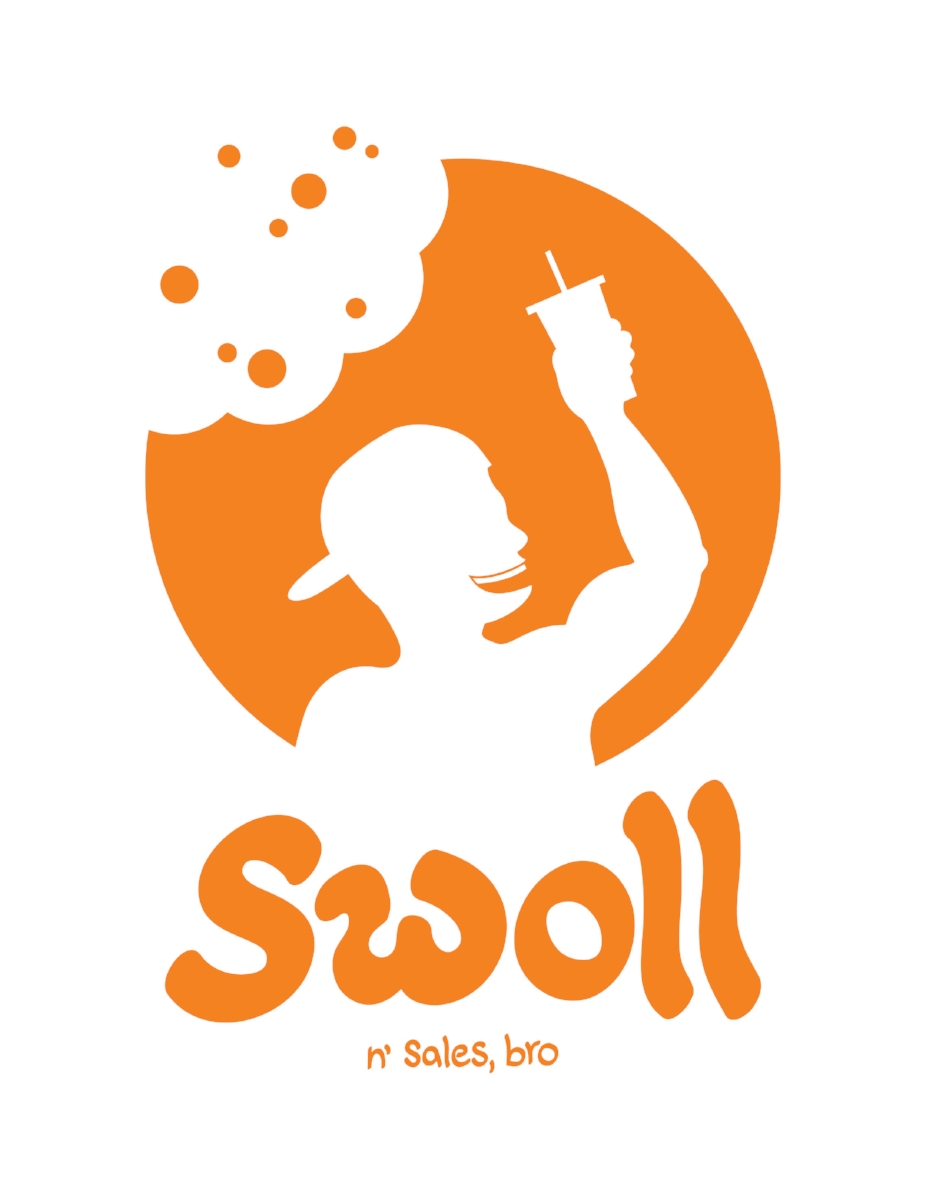
Let's End on a Funny Note
In honor of any man who loves the following things:
Popped collars
Backwards baseball caps
Door to door sales
The hotties at the gym
The shirtless hottie in the mirror
Muscles and getting swoll
... I designed a Swig logo just for you, bro.
(In Vivint orange, no less.)