Image Filters and Style
Ever since doing my project The Home I Never See a few weeks ago, I feel my artistic taste and style evolving. Looking around my own house to take pictures of things I had never seen or truly noticed forced me to stop conforming to what I thought I was supposed to be as an artist. Part of that comes from learning to search for beauty and part of that comes from creating beauty in the photo editing process, the latter being the focus of this post.
I admit that I have frequently been the photographer who relies on one-click filters for photo editing, and then making small and simple adjustments to get it where it I think needs to be. Instagram has done fantastic things for the art and photography world, making "everyone a photographer" both with the the design of its platform, and also with the ease of making a photo look better by finding the right filter to tap your finger on. Similar filters are purchased by professional and hobby photographers alike to use on computers. It could be argued that filters are making the art of photography both better and worse, but that's for another time.
At the least, whether it's actually true or not, (pre-made) filters have set a new standard – a new minimum – for what makes "a good photo." Consequently, a large portion of the photo editing craft has been lost. You can't be unique because you have a cool filter – everyone has it.
To be a photographer that stands out – one that people want to hire – you need something other people don't. For me, I'm both watching myself become more abstract, and also learn how to edit photos in my own way rather than Instagram's way, or otherwise. I attribute these (valuable) changes to what I started with The Home I Never See.
During the editing process (and while searching for things to shoot) I was constantly asking myself "How can I make this interesting?" If the word "interesting" means artistic, different, and attention-grabbing, then pre-made filters will never be interesting. But the editing process was interesting in and of itself: it felt a lot like writing a story where the characters start telling the author what to write, instead of the author deciding for the character what will happen next. The photos felt wrong with certain colors or lighting techniques, demanding to meet a specific aesthetic or not exist at all. The truth is, that happens every time I edit photos, but not necessarily in as deep or thoughtful a way as it did with the photos in this particular project.
Maybe that happens because we're expected to have a style in art. We're expected to be consistent – people hire us for that style and don't want to wonder what their product will look like when its finished. They want to be impressed or maybe even surprised, but still have a subconscious vision of what it ought to look like. We humans are averse to change, and neither clients nor artists are exceptions to that, even though the most highly praised artists throughout history have been the ones who make something different.
When I take pictures, particularly in touristy locations, nature, or anywhere I feel like a thousand people have already taken the same photo, I don't usually care to show everyone the 1,001st copy. To push myself further in the realm of editing – creating a beautiful picture after it's taken – I went through photos I had previously shot but didn't necessarily care about, and turned them into things that I can now call "interesting," even if they're not necessarily my preferred style.
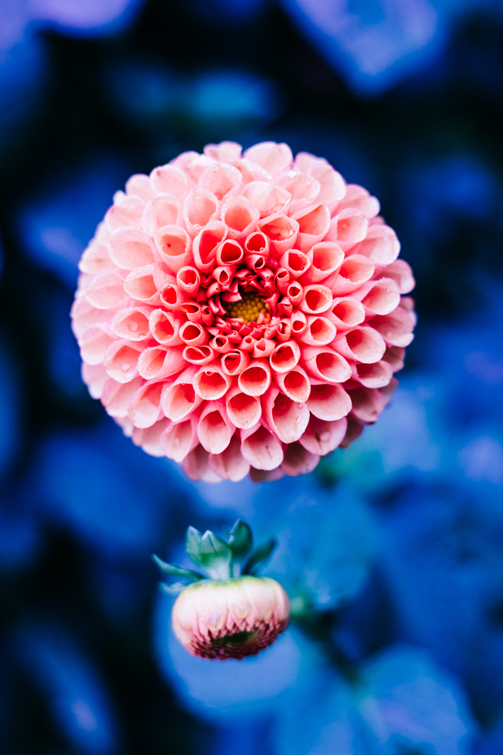
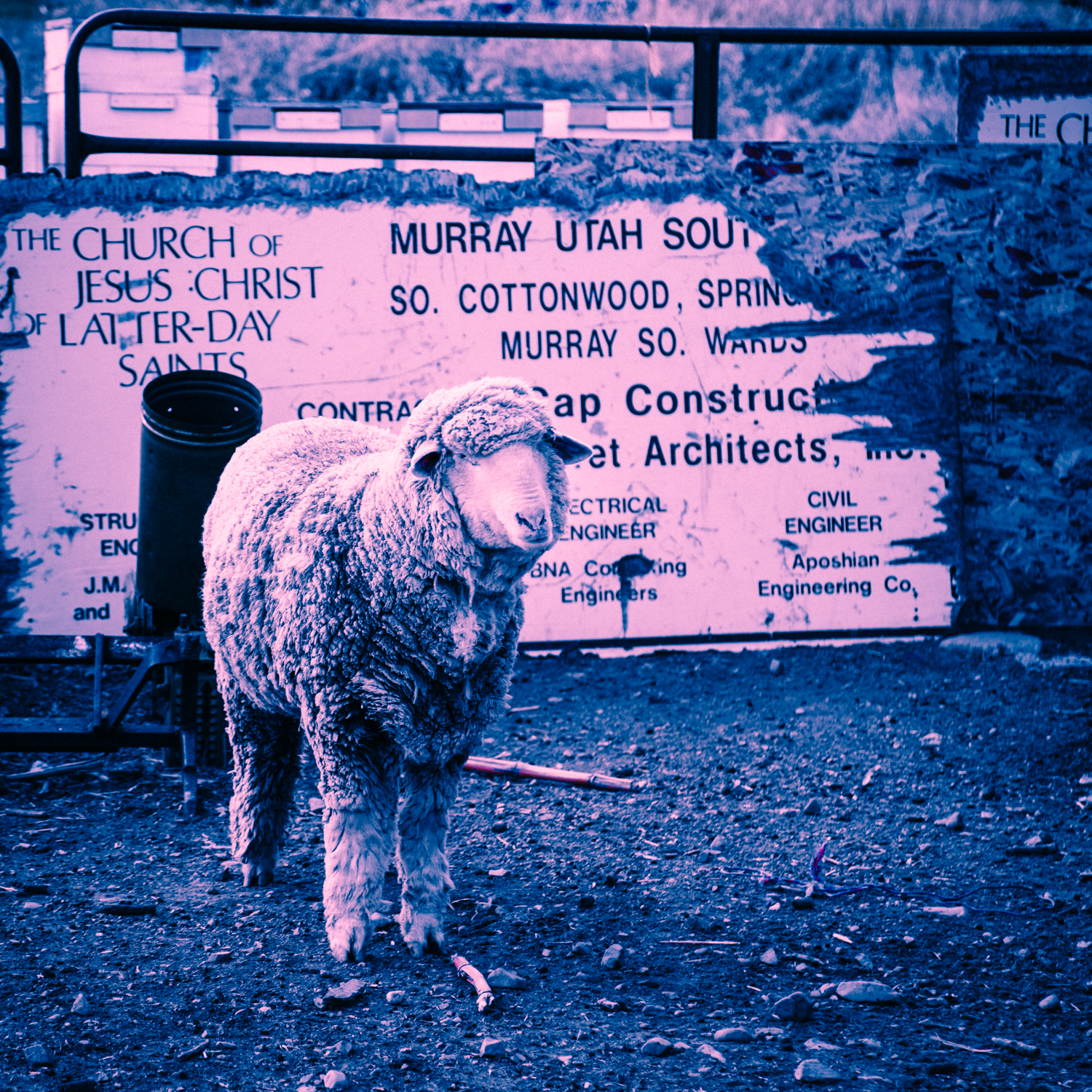
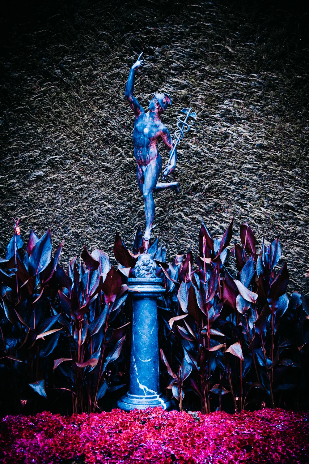
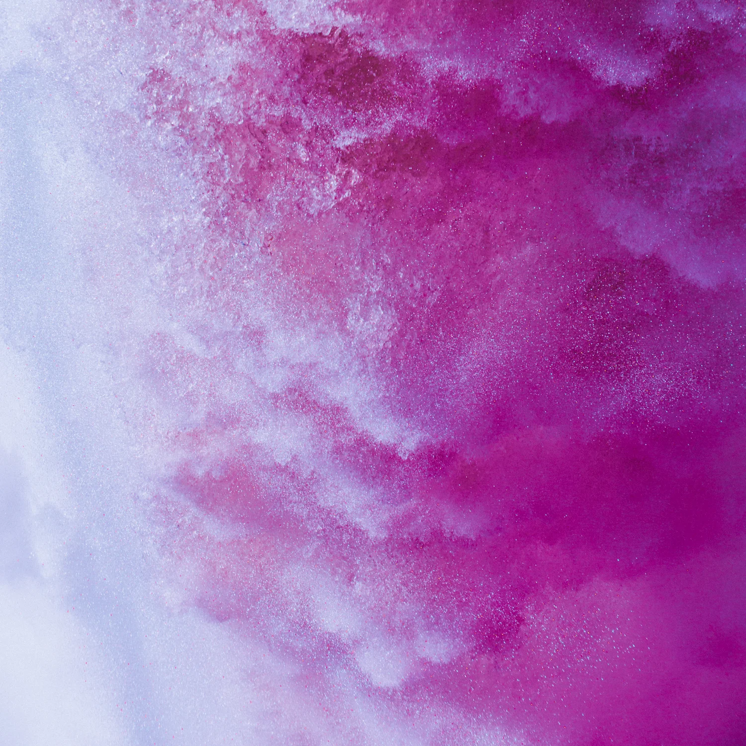
The only edits I made in these photos are with color and light (aside from removing things like camera dust), and, aside from my greenish self-portrait (Adobe Photoshop), I did the editing exclusively in Adobe Lightroom. I played around with every color slider that was available, which I hadn't done before, and discovered multiple tools I knew existed but never touched. And my life has changed, making me want to explore things in the world outside of art that I don't know I'm taking for granted.
I don't know that what I did with these images will necessarily become a consistent style choice of mine (right now, I don't think so). But, without a doubt, the things I learned in the process will have a strong and probably noticeable difference on the work I create in the future, or least the kind of work I search for.
I learned a lot about myself and where I want to go with my art because of simply practicing things with my software. I learned that I really like the colors blue and pink, I learned how to create different emotions with color and light, and I learned new techniques that I am already starting to apply into my work. Essentially, I'm telling every designer, photographer, and artist to start pushing the buttons that your software has provided for you. That doesn't mean pushing things randomly will always work. (I've seen some unfortunate examples of wedding announcements that were clearly designed by someone trying out new software, pushing buttons, and saying "Wow, the software can do that? Cool, I'm using it!") There's still a right way to edit and create things in general and for your specific style. I spent hours learning what not to do – both in general and for specific images – but I promise that exploring what you can do in post-production will help you find the style you didn't know you had.
(Below is a gallery of the images I turned into something I like. Keep in mind they're not cohesive and wouldn't belong in the same art gallery together, but they are were all created/edited in the same week. Click to see the full image.)
